TasteIt
Timeline
10 weeks
Platform
Next.js + Keystatic
Location
San Francisco, California, USA
Services
Product Design, Web Design, Motion
The problem
TasteIt had a bold concept — connecting food lovers with extraordinary culinary experiences — but a product that confused everyone who tried it. Users arrived, tapped a few things, and left without understanding what they were supposed to do next. Retention was below 12% at day 30. There was no social loop, no sense of momentum, and no reason to come back tomorrow. The discovery engine was actually hiding the discovery.
The strategy
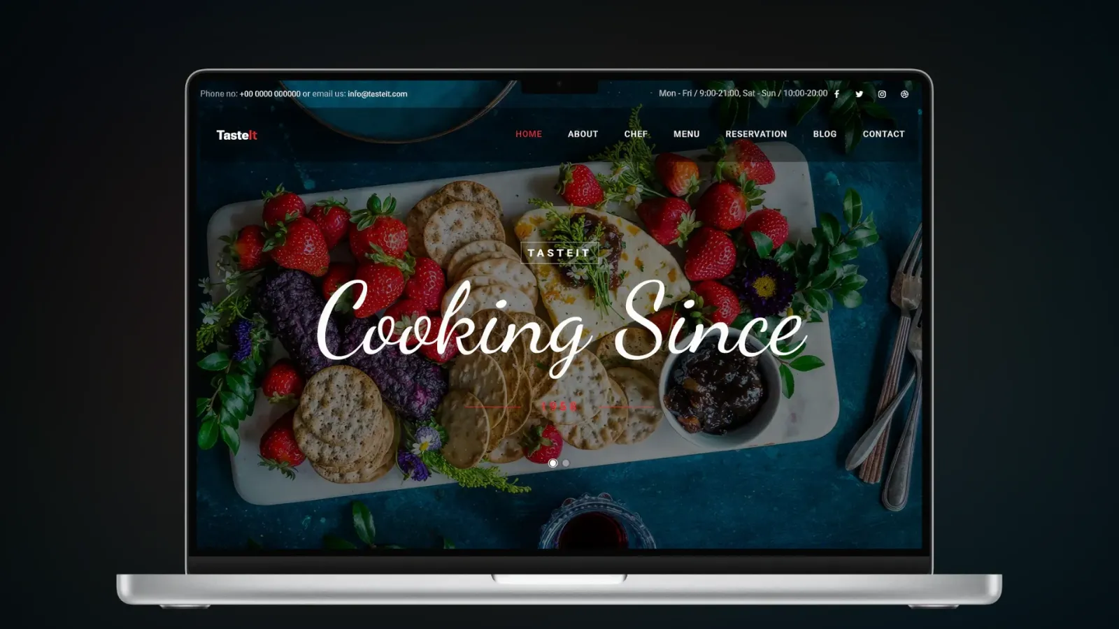
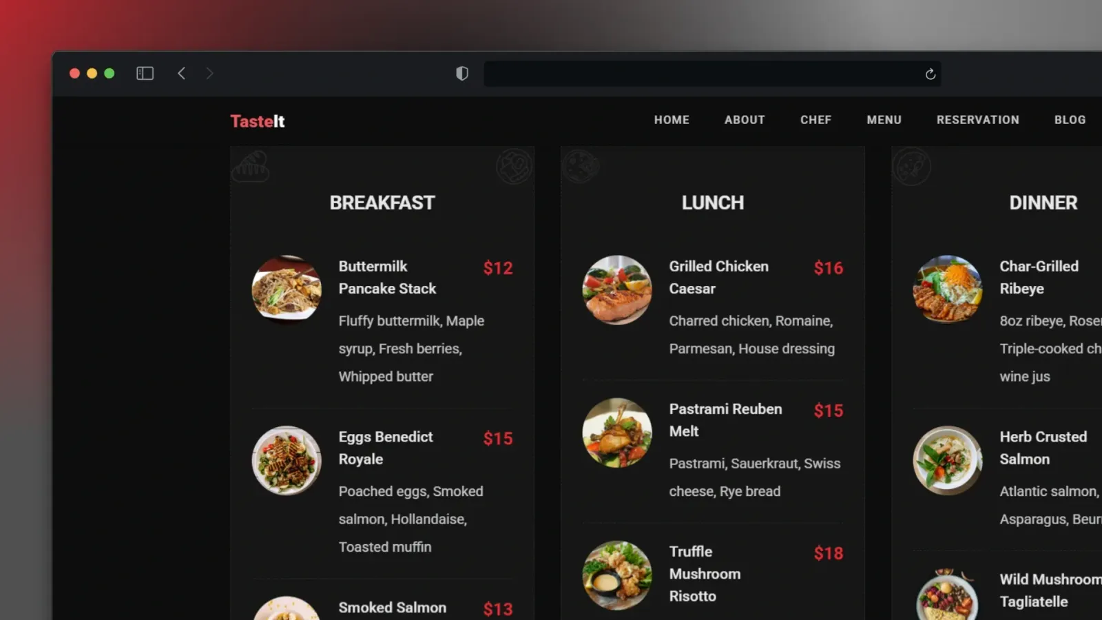
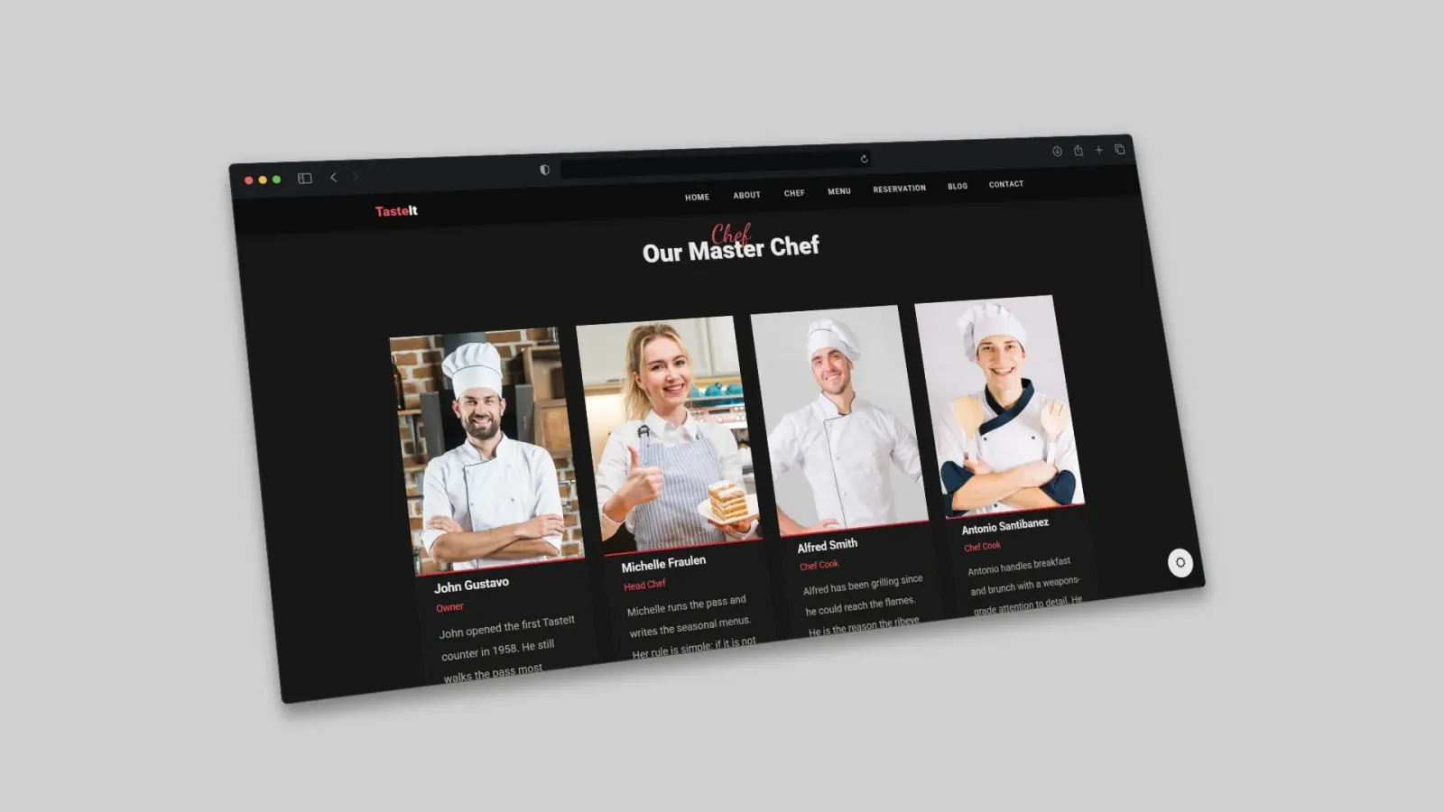
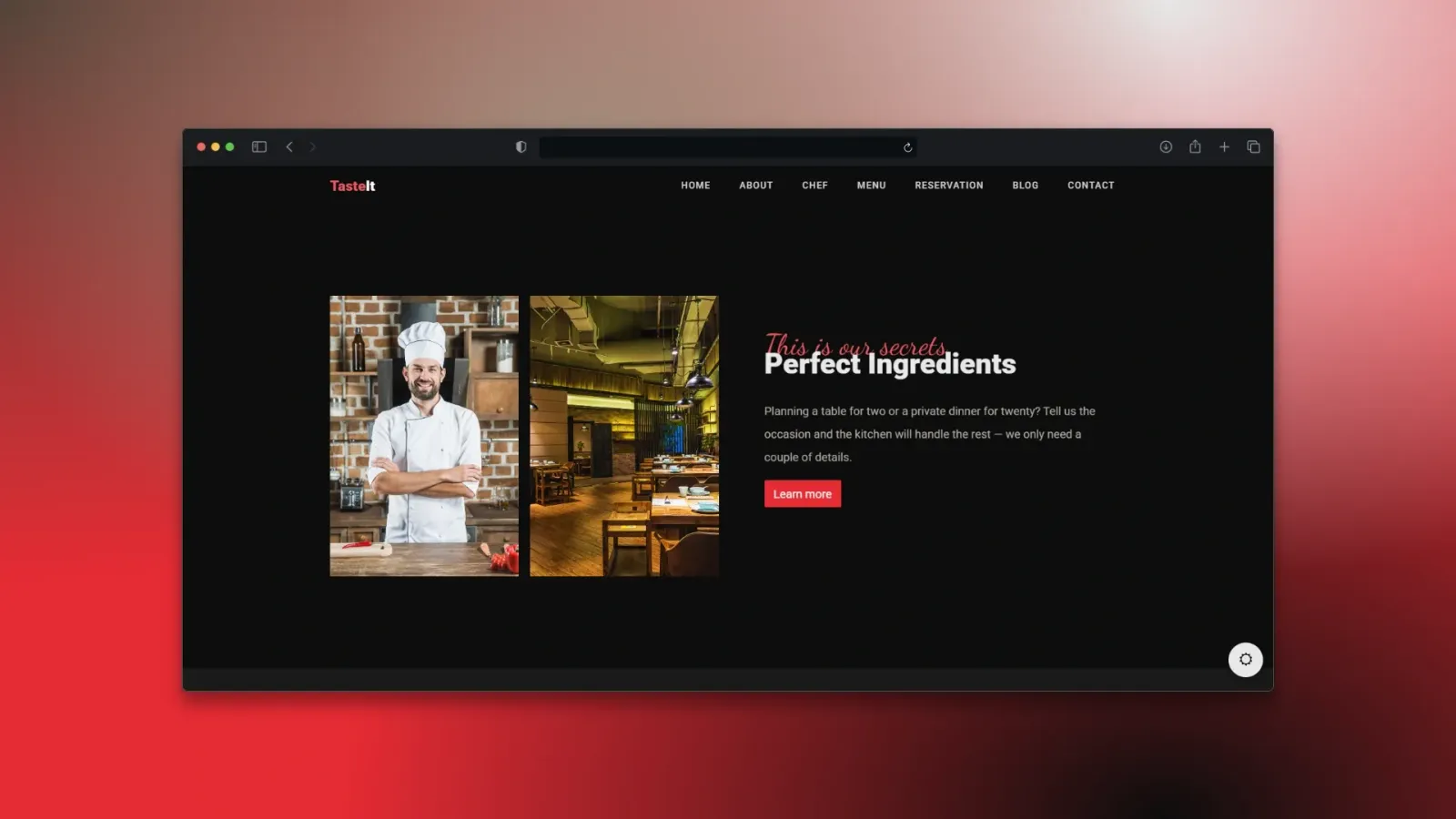
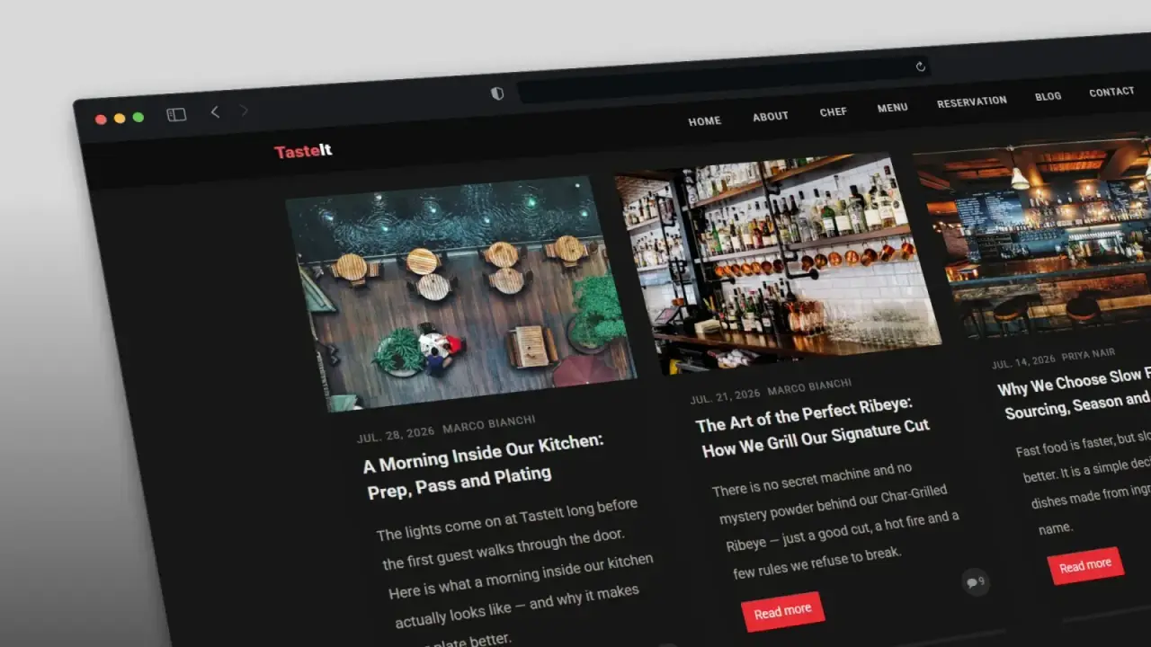
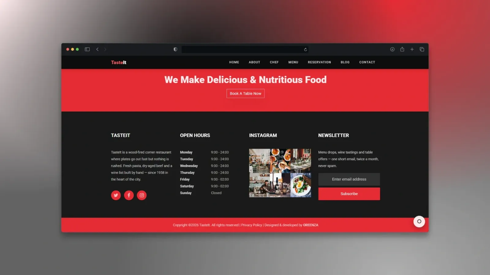
We redesigned the product around two verbs: explore and share. Bold colour to signal energy and differentiate from the clinical look of most food apps. Playful typography that makes the experience feel personal rather than transactional. Intuitive navigation where exploring is the default state — no tutorial required. Motion used deliberately: not decoration, but feedback that tells users their exploration is paying off.
The outcome
A food discovery platform that feels alive. The act of discovering something new is itself the reward — which means users don't need a notification to come back. They just want to.
Measurable results
+340%
Day-30 retention
users returning within 30 days, 60 days post-launch
3.1×
Shares per session
discovery shares and saves per active session
+95%
Sessions per user per week
average weekly active sessions in the first 90 days
From the client
“Users were arriving, tapping a few things, and leaving — retention was under 12% and nobody understood what to do next. OREENZA redesigned the whole experience around explore and share, and suddenly people come back on their own. Day-30 retention is up 340%, and the product finally feels as alive as the community around it.”

Alex Rivera
Co-Founder/TasteIt

Your move
Ready for your own case study?
Every project at Oreenza starts with a conversation about the problem before we ever touch a design tool.